
You’re spending ₹50,000 a month on Meta Ads and traffic is coming in — but your conversion rate is sitting at 1.5% and your ROAS keeps sliding. The ad creative isn’t the problem. Your product page is. Most Indian D2C founders treat product page CRO as an afterthought, which means they’re paying to bring visitors into a room and then giving them no reason to stay.
Every visitor who doesn’t convert is money you already spent. Before you scale your ad budget further, fix the page those ads are sending people to. Here’s what actually moves the needle for Indian D2C brands in 2026.
Why Indian D2C Product Pages Underperform
The average Shopify product page in India converts at 1–2.5% from paid traffic. Brands consistently hitting 4–6% aren’t necessarily running better ads — they’ve built pages that do the closing work. Three problems show up in almost every audit we run:
First, weak above-the-fold hooks. Visitors land, see a product image and a price, and don’t immediately understand why they should care. Your product page headline matters as much as your ad copy — maybe more, because this is where intent turns into action.
Second, missing India-specific trust signals. Indian consumers are more cautious than the Western audiences most CRO guides are written for. COD availability, GST invoices, transparent return policies, and reviews from Indian customers with photos — these aren’t nice-to-haves, they’re table stakes.
Third, a mobile experience that was designed on a desktop. Over 85% of Indian D2C traffic arrives on mobile. If the Add to Cart button isn’t sticky, images require pinching, or the checkout reveals a ₹99 shipping charge nobody knew about — you’re losing buyers who were genuinely interested.
Your Above-the-Fold Section Is Doing Too Little
When someone clicks through from your Meta Ad, they’ve already seen your creative. The product page isn’t the place to repeat it — it’s where you deepen conviction. You have roughly 3 seconds on a mobile screen before an impatient buyer scrolls away or hits back.
Lifestyle images over product-on-white
Your hero image should show the product being used, not sitting in isolation. If you sell a skincare serum, show the result — glowing skin, not a bottle on a marble surface. If you sell a protein supplement, show someone mid-workout. The viewer needs to see themselves in the image immediately. Then use subsequent images to layer in detail: texture, ingredients, size reference, packaging.
Headlines that make a specific promise
“Mango Body Butter 200g” is a label, not a headline. “Deeply Moisturising Mango Body Butter — Dry Skin Gone in 7 Days” is a promise. The specificity matters — Indian buyers have seen enough broad claims to be immune to them. “7 days” is more believable than “instantly.” A modest, concrete promise outperforms an ambitious vague one every time.
Price anchoring with MRP
Show MRP alongside your selling price prominently. “₹499 MRP → ₹349 today” activates the perceived-discount instinct that drives a huge proportion of Indian ecommerce decisions. If you don’t have MRP anchoring, consider per-use pricing — a ₹999 moisturiser reframed as “₹33 per day for 30 days of hydration” suddenly feels like an easy decision.
Trust Signals That Move Indian Buyers Specifically
A D2C brand without a Nykaa or Flipkart listing has to build trust on its own product page. These signals do the heavy lifting.
COD prominently displayed: Cash on delivery is still a major conversion driver, particularly for first-time buyers and tier-2/tier-3 markets. A small “COD Available” badge near the Add to Cart button has driven measurable lifts for brands we’ve worked with — not because the customer intends to pay cash, but because its presence signals safety. It says: even if you’re unhappy, we won’t make it difficult.
Indian customer reviews with photos: Reviews with Indian names, Indian use cases, and photos of the product in Indian homes convert far better than anonymous star ratings. Brands like Mamaearth and mCaffeine built early trust this way. If your review volume is thin, run a post-purchase email with a small incentive — ₹50 cashback or a free sample — for a photo review. That UGC then feeds your ad creative too.
Return policy in plain language, above the fold: “Free shipping above ₹499. Easy 15-day returns. No questions asked.” Put that near the price. Don’t make buyers go looking for it in the footer — the moment they have to search, you’ve introduced doubt.
Mobile CRO: Where Most Brands Leave Conversions Behind
Pull up your product page on a mid-range Android — a Redmi or Realme — not your own phone. What do you see? If the Add to Cart button disappears when you scroll down, if images take 3 seconds to load on 4G, if the variant selector is impossible to use with a thumb — you’ve found where your money is going.
Sticky CTA at the bottom
A fixed bottom bar with the product name, price, and Add to Cart button is table stakes. Every pixel of scroll between a buyer deciding they want the product and actually tapping the button is conversion loss. Most modern Shopify themes support a sticky ATC natively — if yours doesn’t, it’s worth switching.
Video works — even phone-shot video
A 30–45 second product demo embedded early in the page increases time-on-page and conversion rates consistently. It doesn’t need a production budget. A clear, well-lit phone video with text captions (Indian viewers frequently watch on mute) outperforms a glossy reel that takes 5 seconds to load. Test it against no video — you’ll see the difference in session depth within a week.
The Product Description: Write for Two Types of Readers
Most visitors skim. A smaller group of genuinely interested buyers read everything. Your description needs to serve both without making either feel like they’re missing out.
Structure it like this: 2–3 lines of emotional hook or key benefit up top (for skimmers). A bullet list of 4–6 specific features below it (for skimmers who want detail). Then a short paragraph on who this product is specifically for — “This is for you if you’ve tried three serums and your skin is still dry by 3 PM.” That specificity builds trust and reduces returns. Close with a collapsible FAQ covering the 4–5 questions your support team hears most often. Keep the primary description under 250 words.
What to Measure Before You Change Anything
Running CRO without measurement is redecorating without knowing which room has the leak. Set up these metrics first:
- Add-to-cart rate: Below 5% from paid traffic means your product page is the problem. Compare mobile vs. desktop — the gap tells you where to focus first.
- Checkout initiation rate: A drop between ATC and checkout start usually signals a shipping cost reveal or a trust gap at the cart stage.
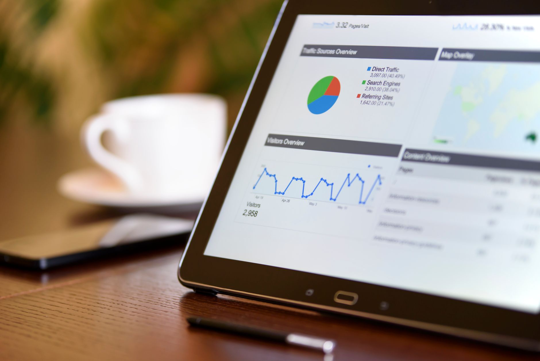
- Scroll depth: Microsoft Clarity (free) shows a heatmap of how far visitors scroll. If most never reach your reviews section, move the reviews up.
- Heatmaps and session recordings: Clarity also records sessions. Watching 10 real Indian buyers interact with your product page tells you more than any benchmark.
Run one change at a time. Give it 7–10 days and a few hundred sessions. CRO compounds — a 1% lift in ATC rate plus a 2% lift in checkout initiation adds up to 30–40% more revenue from the same ad spend over time.
Checkout Is Part of the Product Page Experience
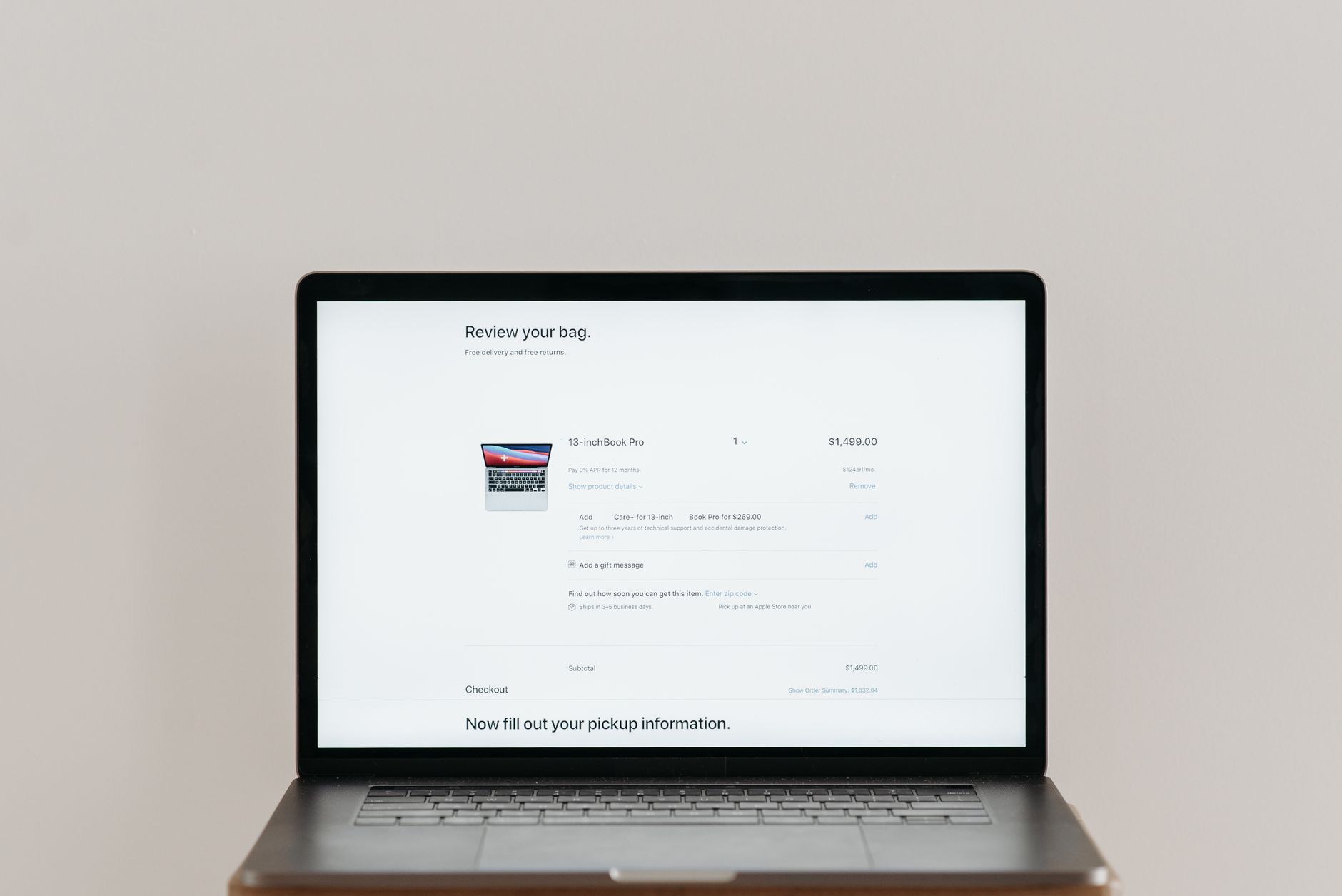
A lot of D2C founders fix the product page and then lose buyers at checkout — and never connect the two. But a buyer who abandons at the payment step saw something on your product page that didn’t prepare them for what checkout would ask. The most common culprit: shipping costs revealed for the first time at the cart or checkout screen.
Show shipping costs (or your free-shipping threshold) on the product page itself. “Free shipping above ₹499” placed near the price, above the fold, does two things at once: it removes a surprise later and it subtly encourages buyers to add one more item to qualify. If you’re using a Shopify upsell app like ReConvert or CartHook, trigger the upsell after “Add to Cart” — not after checkout, where it creates friction.
Payment options matter too, especially for Indian buyers. UPI (Google Pay, PhonePe, Paytm) needs to be visible as a primary checkout option — not buried below credit card fields that most Indian buyers don’t use as their first choice. EMI through Simpl or LazyPay is worth adding for higher-ticket D2C products (above ₹1,500) where EMI converts meaningfully better than full-price lump sum.
One quick audit: run a session recording on your checkout page using Microsoft Clarity. Watch 10 real sessions. You’ll see exactly where buyers pause, re-read something, and then leave — and those pauses tell you what to fix faster than any analytics dashboard will.
Start with your Add to Cart rate this week. If it’s below 5% from paid traffic, no amount of additional ad budget will fix what’s actually broken. Fix the page. Then scale.